🔧 Execution
-
Step 1: Use Chat To Create Content
Use Chat AI to ask it to create the outline using the prompt below. (Example is based off Correlation vs Causation Training)
"Create an outline based off a summary of our conversation that I can use in an modern newspaper style infographic generated with an AI tool" -
Step 2: Expected Output (Your Output Should Look Something Like This)
Output 1 - Infographic Outline
🧱 1. Layout Structure (Very Important)
Instead of a typical "busy infographic," use a column-based layout:
Recommended Structure:
[HEADLINE] [Subheadline / intro] | Column 1 | Column 2 | |----------|----------| | Ice Cream Example | Marketing Example | [Full-width Confounding Variable Section] | Control Group | Key Takeaways | 👉 Keep everything aligned to a grid system 👉 Avoid floating/random elements📰 2. Typography (This is the STYLE)
Use 3 Levels Only:
- Headline: Bold serif or clean sans-serif (large)
- Section Titles: Medium weight
- Body: Light, simple, readable
Example:
- Headline: "Correlation Isn't Proof"
- Section: "The Hidden Variable"
- Body: short, punchy sentences
👉 Avoid: Too many fonts, Decorative fonts, Long paragraphs
🎨 3. Color Strategy (Minimal)
Stick to: Black, White, Gray tones, ONE accent color only
Use color intentionally:
- 🔴 Red → Wrong assumption
- 🟢 Green → Correct logic
- OR 🔵 Accent → Highlight key insight
👉 Do NOT color everything
👉 Color = meaning, not decoration📊 4. Visual Style (Simplify Everything)
Replace: ❌ Complex illustrations, ❌ 3D graphics, ❌ Busy icons
With: ✅ Simple line icons, ✅ Thin arrows, ✅ Minimal charts (2–3 bars max), ✅ Clean diagrams
🧠 5. How to Apply It to YOUR Sections
Section: Ice Cream vs Shark Bites
Style Conversion: Instead of cartoon visuals:ICE CREAM SALES ↑ SHARK BITES ↑ Small note under: "Strong correlation" Then below: CAUSE? [ NO ] Minimal arrow with a red strike-throughSection: Confounding Variable
Center this like a headline moment:TEMPERATURE ↑ Drives Both Then below in small type: • Ice Cream Sales ↑ • Shark Bites ↑ 👉 Make this the visual focal pointSection: Marketing Example
Use editorial tone:Headline: "Did Marketing Drive Black Friday Sales?" Subtext: "Or did demand already exist?" Then list (clean bullets): • Discounts • Traffic surge • Seasonal intent 👉 No icons needed—text can carry itSection: Control Group
Use a very simple comparison chart:Group A (No Campaign) | ████ Group B (Campaign) | ████████ Caption: "Difference = True Impact"Section: Key Takeaway (Bottom)
Make it feel like a newspaper closing:CORRELATION SHOWS PATTERNS. CAUSATION REQUIRES PROOF. Small footer: "Use controls. Question assumptions."✍️ 6. Writing Style (Critical)
Write like headlines, not explanations:
Instead of: "Correlation does not imply causation because…"
Write: "Correlation is not causation."Instead of: "Black Friday increases consumer demand…"
Write: "Black Friday creates demand."Output 2 - AI Prompt
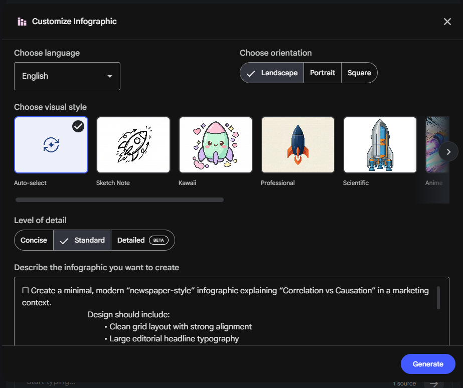
Create a minimal, modern "newspaper-style" infographic explaining "Correlation vs Causation" in a marketing context. Design should include: • Clean grid layout with strong alignment • Large editorial headline typography • Black, white, and grayscale color palette with one accent color • Minimal text with short, bold statements • Simple diagrams using thin lines and arrows • Sections for: 1. Ice cream and shark bite correlation 2. A clear "correlation ≠ causation" moment 3. A central confounding variable (temperature) 4. A marketing example showing Black Friday sales attribution 5. Multiple contributing variables to sales 6. A control group comparison 7. Strong closing takeaway Style should feel like a modern newspaper or financial editorial graphic. Minimal, elegant, data-focused, high readability, lots of whitespace. -
Step 3: Validation
Review the content to make sure the key details are correct and make any manual changes you want to.
-
Step 4: Input In NotebookLLM
In NotebookLMM click the 'Create New' button on the main page

On the next screen click 'Copied Text'
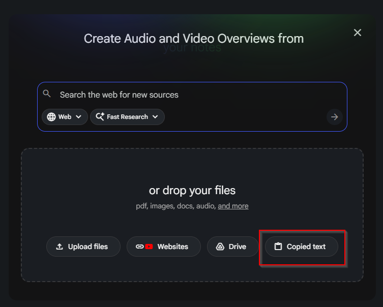
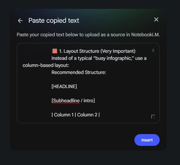
Paste the 'Infographic Outline' into the box and click Insert
In the Studio section click the arrow next to Infographic
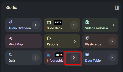
In the Studio section click the arrow next to Infographic and paste in the 'AI Prompt' response and click Generate
-
Final Result
Without Style Prompt:
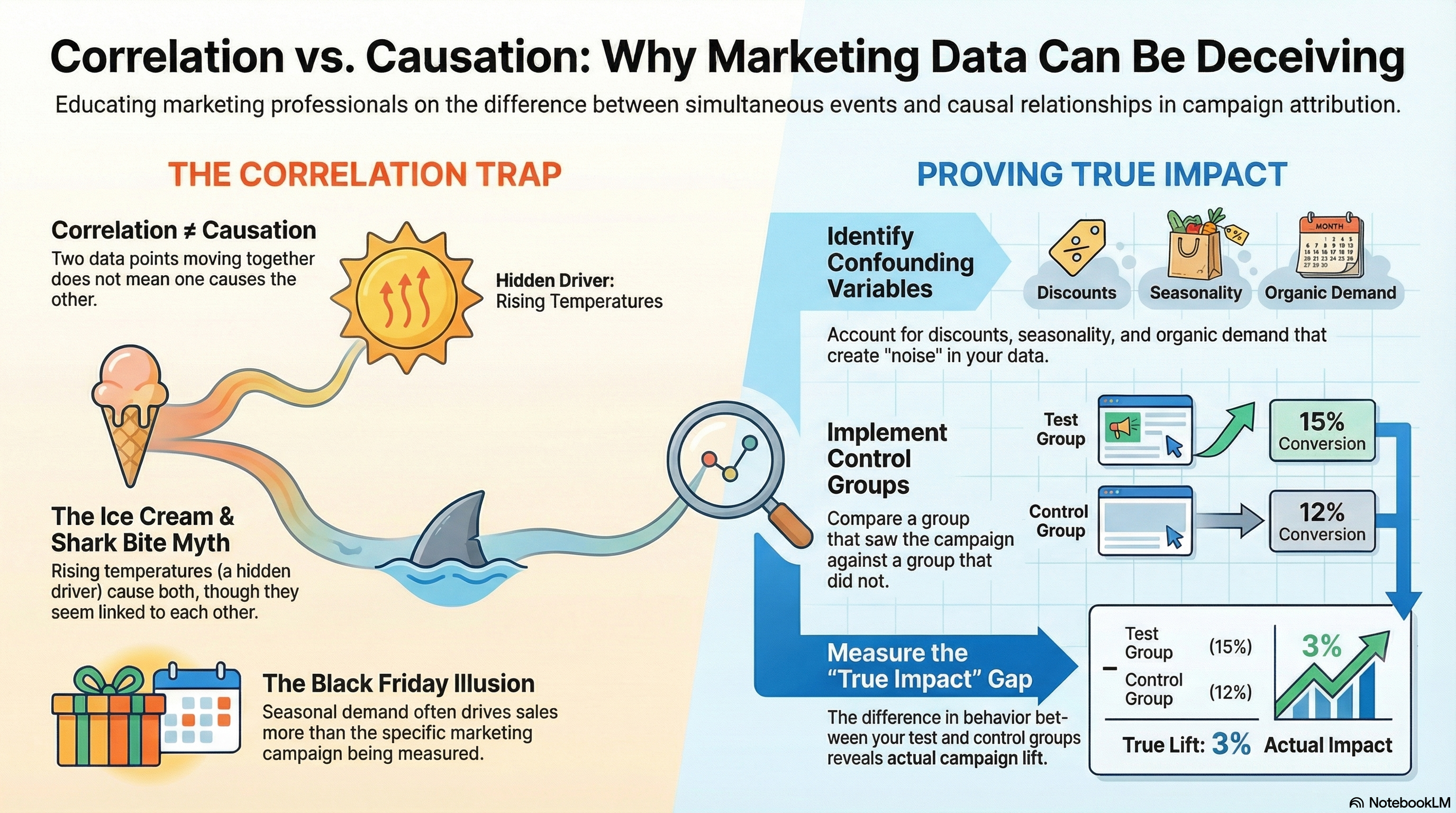
With Style Prompt:
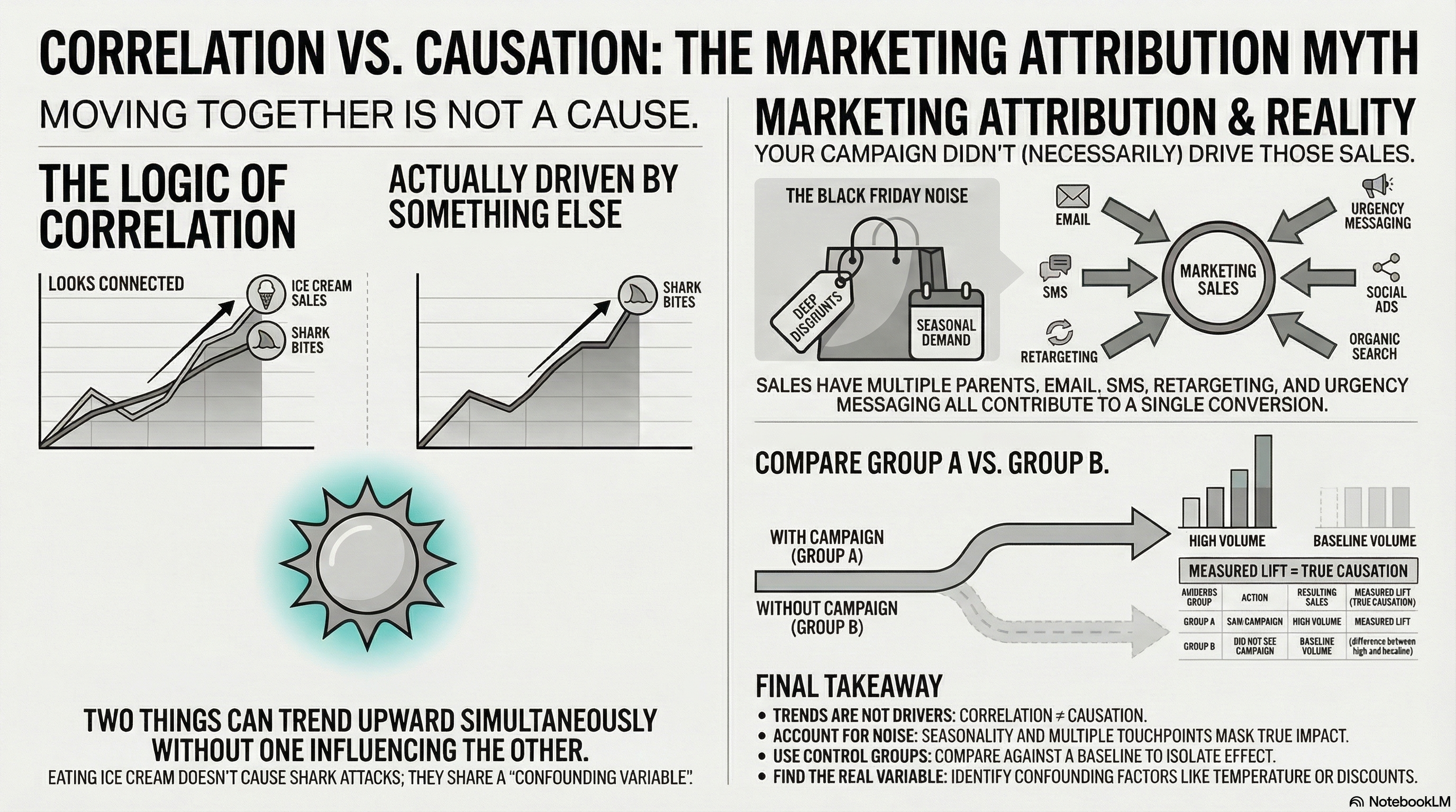
-
Step 5: Validate Out & Iterate if necessary
Check the generated infographic and make adjustments as needed.